How to create an animated banner using CSS3. Responsive banners in HTML5 and CSS3 Easily create banners in css3
Hi, so the task is: “Create responsive HTML banner that will adjust to different sizes screen, it will have a counter of the remaining time and a button to close, and all this must also count the clicks in order to collect statistics on the transitions on the TT Adriver ”.
First, let's figure out what are the most popular formats when creating such banners:
In general, there are a lot of these banners, you can get acquainted with all the technical requirements and formats here: click, but we will use only a few, because the rest are either no longer relevant, or almost repeat these:
- FullScreen banners - banners that you could see in the metro or on the wifi website, these banners expand to full screen, have a counter and a close button. To create such banners, we simply prepare a static image or a simple gif animation(no more than 600KB) and then typeset everything in HTML.
FullScreen Banner
- FullWidth banners are already more interesting, but in reality they are just a regular HTML5 banner, only stretching to 100% of the screen width, but having a fixed height. These banners often use animation and are already created in programs such as google web designer, Adobe Edge Animate, Adobe Animate CC. Personally, I actively use Edge Animate, it is more convenient, faster and has the ability to quickly upload to HTML5. When creating such banners, a storyboard is initially made with options for how this banner will look when different sizes screen, the whole thing looks like this:

Banner storyboard at 100% width
- Banner with a fixed size or static - well, it's quite simple. Here you just create a creative or a storyboard and all that remains to be done is to write the code for counting clicks. To create such banners, I often use Adobe photoshop or Edge Animate if it's animation. Never use GIFs here! You can never upload a gif animation up to 600KB in size, and if the animation weighs more, it will not be missed. Normal HTML banner will not hold out in weight and up to 200KB, which means that here you can create to the fullest.

Fixed size banner storyboard
Guide to creating a FullScreen banner according to all the rules
The creation of such a banner implies that its size will change when the screen size changes, which means it will occupy its entire area, something like this:
This means that the image should look equally good on all devices, from here it is concluded that it should be enough good quality and the size is close to square(there are no fixed sizes, everything is pretty loyal here). At the moment we are guided by mobile devices (mobile) and tablets (tablet), therefore we take a rectangle for viewing in portrait mode (portrait). We go into Photoshop and create a document of the required size, in this case it is 536x714:

Gif source for creating a FullScreen banner
I created a gif from two frames, its weight is 242KB, our weight should always be up to 600KB, remember that. Now we need to turn this into a proper HTML banner. Open the instructions for creating FullScreen banners, take the technical requirements from it and close it, it is written very clumsily. Forget Flash, it died a heroic death, we only have HTML5, so we need technical requirements to create banners using Ajax code.
There are no restrictions on layout, here we are free to create whatever we want, the main thing is that the main attributes are present, namely: A click was read from the banner, there was a counter and a cross to close. For coding, I use free software Sublime Text.
We open HTML file from my template and see:

Standard Banner Code FullScreen


Close button
How does the click itself read from the banner? And why didn't we register any links to the pages to which the banner should lead? So ... The Adriver system allows you to prescribe links to go to the site, after the banners are loaded into the system, it turns out that in our source code we just prescribe a variable that is replaced when loading into the system itself, it is no longer our job. In this case, we register a click for the entire container in which our banner is located, in general, everything that we put in
Container with banner
In other lessons, I will tell you how to create a banner with 100% screen width with animation and how to create and prepare a layout for website layout according to all the rules.
Files from the lesson:
- Ready-made FullScreen banners: click
Thank you for the attention.
Friends, hello everyone. Today we will continue to create banners in google program Web Designer in HTML5 format with 3D effect.
And this is understandable, banners created in html5 and css3 are displayed on any screens, both on computers, TVs, and on mobile devices. The same cannot be said about flash banners.
In addition, these banners can be, just use and the banner will look great on any screen.
And given the fact that mobile devices more and more are used to browse Internet resources, then - this is very important.
The main one and its placement on the site I have already described in the last article. So today I will focus on creating the 3D effect and setting the cycling (re-display). And also consider a few settings for "events".
It is rather difficult to describe this whole process in detail, so I bring to your attention a video tutorial. This will make it much easier to master the material. And also download the archive with the project of my banner, as an illustrative example.
Preparing to create a banner with a 3D effect.
The final appearance of the banner depends on the preparation. The Google Web Designer editor allows you to create realistic 3D effects and all this will be written in html code, you just need to put everything together correctly in the visual editor.
To create a high-quality 3D effect, you need to pre-cut the blanks in Photoshop, which will later need to be joined in Google Web Designer.
As an example, I have prepared the following blanks:
I made these blanks in Photoshop, but there are many similar images on the Internet. You don't have to strain yourself, but take ready-made options.
Note: If you are interested in the process of creating such templates, write about it in the comments.
It is also important to think over the overall banner composition and script. How the banner will be perceived as a whole depends on this.
Creating a 3D object in Google Web Designer.
So, by analogy with the last article, start the editor, create a new project.

The 3D effect means a composite image, that is, an image consisting of several pieces located in the desired projection.
These multiple images need to be combined either into a group or placed in a DIV block. And so and so it will be right. But, it's more convenient for me to work with the DIV side.
Step 1. Create a DIV block.
So, to create a DIV block, in the left panel, select "Tool for working with tags (D) ".

Be sure to assign an ID. And resize using the section "Properties" in the right pane.
Now we need to select the block. To do this, in the left pane, select "Selection tool (V) " and by double-clicking the left mouse button, click on the frame of the DIV block. At the same time, it will change color to red.

Step 2. Arrange the images.
And now the most painstaking process begins. It is necessary to expose all the elements of one single image.
I have the following elements at my disposal:
- Upper side.
- Side (consists of three separate parts).
First, place the back (back) side of the image and align it to the center and top edge of the banner.

Add the front side in the same way. Align and offset along the Z axis.

Since the side width is 4px (pixels), I moved the front and back sides along the Z axis by 2px and -2px. Which will provide a gap between the images.
Note: see the screenshots for the exact displacement figures.
Next, add the side, all the pieces separately. For ease of placement, use tools "3D rotating the work area " and "Scale"... They will help you to precisely fit all the details.

To begin with, I suggest that he will build all the images, on one side, and then copy them and place them in a mirror projection on the other side.
The next step is to build the upper left corner.

Now the center part of the side.

And the bottom corner is on the left side.

Be sure to align all elements of the side with the Y-axis at 90 0.
Now you need to copy the desired layer and paste it again, renaming and changing the location parameters, so we get the elements for the right side.
To do this, select an image in the bottom panel - press the key combination CTRL + C (copy) and paste a duplicate CTRL + V.

Let's start in the same way as for the field side from top to bottom, but only for the right.
Top right cap.


I did not make the lower part, since it is not visible in the image.
The hardest job is over. Now you can start customizing your animation. As a visual demonstration, let's rotate the image.
Creating a rotation effect in Google Web Designer.
The first step is to get out of the DIV block, which contains all the image elements. That is, we worked inside the block with specific images, and now we will need to work with all images at the same time, controlling the DIV block.
First, click on the DIV button in the bottom panel.

So, on the chalet of time, by pressing the right mouse button, you create two keyframes. It should look like this:

Set the location of the source frame on the Y scale at -90 0.

Set the first keyframe (the second in a row) on the Y scale to 0 0.

The second keyframe (the third in a row) is set on the Y scale at 90 0.

Everything can be checked the result. To do this, click on the button Play.
True, our image will only make one rotation. In order for the image to rotate constantly or to make several rotations, you need to adjust the cyclic parameters.
Setting up looping in Google Web Designer.
In the program, you can configure several options for cyclicity (repetitions). This way you can set up repeat for all elements of the banner or for each element separately.
Also, the cyclicity can be limited by the number of repetitions or made it infinite.
On the bottom panel, next to each item there are symbols Lock, Eye, Reverse Arrow.
So, to set the cycle, you need to click on the symbol "Reverse arrow". And choose either a limited number of repetitions or an endless option.

I chose endless looping of the animation. Since in the future I want to configure "Developments" in such a way that the rotation will stop when you hover the mouse cursor and continue after the cursor is removed.
Stop rotation when hovering the mouse cursor over the banner.
First of all, set a shortcut on the first keyframe (the second in a row). To do this, press the right mouse button above the frame and select the menu item "Add shortcut"... Enter the name of the shortcut and press the Enter key.

And on next step choose as receiver « Page1 "... There will be no other options there.
And the final step, choose the shortcut that you created at the initial stage.

Save events and check. The rotation of the banner will stop when you hover the mouse cursor on the frame where the shortcut was made.
Resuming rotation after moving the mouse cursor.
In order for the rotation to continue, after moving the cursor to the side, set up one more event.
It is configured similarly to the previous one, with only two differences.
The event is selected "Mouse"— « mouseout ".

Event - mouse abduction
And as an action Timeline — « togglePlay ".

Action - Continue
Our banner with a 3D effect is ready. And you can come up with as many different effects as you like.
Just do not forget to make an event for a mouse click and link opening. The banner was not created for the sake of beauty, after all.
Initially, this process may seem complicated, but after making a couple of banners, you will no longer seem so.
That's all for me today, friends. I wish you all success, I look forward to your comments and see you in new articles and video tutorials.
Best regards, Maxim Zaitsev.
Today we are going to create a banner using CSS3 animation.
Currently, only Firefox and WebKit browsers support CSS animation, but we'll be looking at how we can make these banners also function in other browsers (which I call 18th century browsers). However, you shouldn't expect great support across all browsers (particularly IE 7 and below) when experimenting with modern CSS technologies.
So let's create animated banners!
Please note: In order to save space, all browser prefixes have been removed. Cm. source files to see all the CSS. If you are unfamiliar with CSS animation, I highly recommendfirst of allread this.
HTML markup
First, we will create the banner structure by HTML help... At this point, we need to think about how we want our animation to work - how this will affect the children and parents in the structure of our markup (I'll explain this below):
>
>
>
>
>
>
>
>
>

To understand the structure of our markup, let's focus on the boat for a second:
>
>
Now, let's take a look at the first banner on the demo page. There are three separate animations that take place on the ship:
- Animation - when the boat slides to the left. This applies directly to an unordered list (a group of boat items).
- Animation - which gives the boat a rocking effect, simulating a boat floating on the water. This applies directly to the list items (the boat).
- Animation - which hides the question mark. This applies to the div (question-mark).
If you are not seasick, then take another look at the demo page. You will see that the animation that is applied to the list item (boat), causing the boat to lift, also affects the DIV inside it (with a question mark). In addition, the "slide in" animation that is applied to the unordered list (group) also affects the list item and the DIVs inside it (the boat and the question mark). This brings us to important observations:
Child elements inherit animation from their parents, in addition to their own animation. This knowledge has been added to our arsenal, but the number of children / parents when creating an animation will blow your mind (and the processor on your grandma's laptop)!
CSS
Before we get into the really cool stuff and start creating animations, we still have to create styles for browsers that are stuck in the 18th century.
Fallback styles for older browsers
We'll just create fallback styles as if CSS animation didn't exist (the thought that CSS animation doesn't exist will make any adult not only cry, but hang next to me :)). In other words, if our animation fails to play, the banner should still look decent. This way, when someone views a banner using an old browser, they will see a normal, static banner instead of empty space.
For example: if someone uses CSS like this, there will be problems:
/* WRONG WAY! * /
0% (opacity: 0;)
100% (opacity: 1;)
}
Div (
opacity: 0; / * This block is hidden by default! * /
}
If the user's browser does not support animation, the banner will remain invisible to him. And then the client will break down the door in the seller's office - with a chainsaw in hand - and demand that they explain to him why they did not sell his product! And if they are unable to understand that the browser can be so miserable, their life will end horribly, and their last words will be curses against Internet Explorer ... :)
But don't worry, we will provide advanced browser support:
/* THE RIGHT WAY */
@keyframe our-fade-in-animation (
0% (opacity: 0;)
100% (opacity: 1;)
}
Div (
opacity: 1; / * this div will be visible by default * /
animation: our-fade-in-animation 1s 1;
}
As you can see, the DIV will show even if the animation fails to play. If the animation is playable, then the DIV will be hidden immediately and the animation will play to the end.
Now that we know how to make our animated banners support older browsers, let's move on to some basic CSS.
There are three key things to keep in mind:
- Since these ads can be used on various websites, we will make all our css styles very specific... We will begin declaring each selector with id: # ad-1. This will keep our banner styles from interfering with existing styles and elements.
- We will be purposeful ignore animation delay feature when creating our animation. If we were to use the animation delay feature, as well as design our elements in the correct way (visible by default), it would all be visible on the screen before the animation finally started playing. This is why the animation starts immediately, which allows us to hide elements from the screen until we need them. We will simulate animation delay by increasing the duration and manually adjusting the keyframes. You will see examples of this when we start creating animations.
- If possible, use one animation for multiple elements... This way we can save a lot of time and reduce code sprawl. You can create several different effects in the same animation by adjusting the duration and transitions.
So, we will start creating our banner ad. Let's make sure it has a relative position (position: relative) so that the elements inside it can be positioned correctly. We also need to make sure the overflow: hidden property is set to hide any unnecessary things:
# ad-1 (
width: 720px;
height: 300px;
float: left;
margin: 40px auto 0;
background-image: url (../images/ad-1/background.png);
background-position: center;
background-repeat: no-repeat;
overflow: hidden;
position: relative;
box-shadow: 0px 0px 6px # 000;
}
# ad-1 #content (
width: 325px;
float: right;
margin: 40px;
text-align: center;
z-index: 4;
position: relative;
overflow: visible;
}
# ad-1 h2 (
font-family: "Alfa Slab One", cursive;
color: # 137dd5;
font-size: 50px;
line-height: 50px;
animation: delayed-fade-animation 7s 1 ease-in-out; / * H2 will fade out with simulated animation delay * /
}
# ad-1 h3 (
color: # 202224;
font-size: 31px;
line-height: 31px;
text-shadow: 0px 0px 4px #fff;
animation: delayed-fade-animation 10s 1 ease-in-out; / * H3 will fade out with simulated animation delay * /
}
# ad-1 form (
margin: 30px 0 0 6px;
position: relative;
animation: form-animation 12s 1 ease-in-out; / * This code moves our email form * /
}
# ad-1 #email (
width: 158px;
height: 48px;
float: left;
padding: 0 20px;
font-size: 16px;
font-family: "Lucida Grande", sans-serif;
color: #fff;
text-shadow: 1px 1px 0px # a2917d;
border-top-left-radius: 5px;
border-bottom-left-radius: 5px;
border: 1px solid # a2917d;
outline: none;
box-shadow: -1px -1px 1px #fff;
background-color: # c7b29b;
background-image: linear-gradient (bottom, rgb (216, 201, 185) 0%, rgb (199, 178, 155) 100%);
}
# ad-1 #email: focus (
background-image: linear-gradient (bottom, rgb (199, 178, 155) 0%, rgb (199, 178, 155) 100%);
}
# ad-1 #submit (
height: 50px;
float: left;
cursor: pointer;
padding: 0 20px;
font-size: 20px;
font-family: "Boogaloo", cursive;
color: # 137dd5;
text-shadow: 1px 1px 0px #fff;
border-top-right-radius: 5px;
border-bottom-right-radius: 5px;
border: 1px solid # bcc0c4;
border-left: none;
background-color: #fff;
background-image: linear-gradient (bottom, rgb (245, 247, 249) 0%, rgb (255, 255, 255) 100%);
}
# ad-1 #submit: hover (
background-image: linear-gradient (bottom, rgb (255, 255, 255) 0%, rgb (255, 255, 255) 100%);
}
Now we will style the water and animate it accordingly:
# ad-1 ul # water (
/ * If we wanted to add another animation for the water (moving horizontally, for example), we could do it here * /
}
# ad-1 li # water-back (
width: 1200px;
height: 84px;
background-image: url (../images/ad-1/water-back.png);
z-index: 1;
position: absolute;
bottom: 10px;
left: -20px;
animation: water-back-animation 3s infinite ease-in-out; / * Water bouncing effect * /
}
# ad-1 li # water-front (
width: 1200px;
height: 158px;
background-image: url ( ../images/ad-1/water-front.png)
;
background-repeat: repeat-x;
z-index: 3;
position: absolute;
bottom: -70px;
left: -30px;
animation: water-front-animation 2s infinite ease-in-out; / * Another effect of the water bouncing is slightly different. We'll make this animation a little faster to create some kind of perspective. * /
}
Now let's style the boat and all of its elements. Again, we'll call the appropriate animation:
# ad-1 ul # boat (
width: 249px;
height: 215px;
z-index: 2;
position: absolute;
bottom: 25px;
left: 20px;
overflow: visible;
animation: boat-in-animation 3s 1 ease-out; / * Move group first * /
}
# ad-1 ul # boat li (
width: 249px;
height: 215px;
background-image: url (../images/ad-1/boat.png);
position: absolute;
bottom: 0px;
left: 0px;
overflow: visible;
animation: boat-animation 2s infinite ease-in-out; / * Simulation of a boat swaying on the water - a similar animation is already used for the water itself. * /
}
# ad-1 # question-mark (
width: 24px;
height: 50px;
background-image: url ( ../images/ad-1/question-mark.png)
;
position: absolute;
right: 34px;
top: -30px;
animation: delayed-fade-animation 4s 1 ease-in-out; / * Hide the question mark * /
}
Finally, we will style the cloud group and one cloud. We'll also call a pretty nifty animation that will give them a continuous scroll effect. Here's an illustration of what will happen:

These styles are:
# ad-1 #clouds (
position: absolute;
top: 0px;
z-index: 0;
animation: cloud-animation 30s infinite linear; / * Move clouds to the left, infinite number of times * /
}
# ad-1 # cloud-group-1 (
width: 720px;
position: absolute;
left: 0px;
}
# ad-1 # cloud-group-2 (
width: 720px;
position: absolute;
left: 720px;
}
# ad-1 .cloud-1 (
width: 172px;
height: 121px;
background-image: url (../images/ad-1 / cloud-1 .png);
position: absolute;
top: 10px;
left: 40px;
}
# ad-1 .cloud-2 (
width: 121px;
height: 75px;
background-image: url (../images/ad-1 / cloud-2 .png);
position: absolute;
top: -25px;
left: 300px;
}
# ad-1 .cloud-3 (
width: 132px;
height: 105px;
background-image: url (../images/ad-1 / cloud-3 .png);
position: absolute;
top: -5px;
left: 530px;
}
Ufff! There was a lot of CSS code here. But the fun is next!
Animation
Remember: Until this moment, there was actually no animation. If you viewed the banner now, you would see something that even an old browser will show - a static ad. WITHnowwe will actually create the animation that we have already called in our CSS code.
Now that our banner is displaying well, let's animate this static ad! Let's go straight to the code - I'll tell you in the comments what will happen:
Conclusion
In the course of this tutorial, we learned the key points of creating animations with support for older browsers:
- Child elements inherit animations from their parents in addition to their own animations. We can use this to create more complex animations.
- For our ad styles, we need to use very specific selectors so that our ads are not overridden by other site styles.
- We need to style the elements so that if our animation fails to play, the ad should still look decent.
- Whenever possible, using one animation for multiple elements saves time and prevents code sprawl.
- We often refer to Internet Explorer as the "18th century browser" and shake our fist in disgust and anger. :)
Good luck with your CSS experiments.
Undoubtedly one of the brightest trends 2012 is development on CCS3, HTML5. Today we offer a large and very useful overview of examples " 20+: Creative and Useful CSS3 Tutorials ″ proposed at SpeckyBoy... All examples are made on clean without JavaScript, in the presented tutorials there are demos and ready-made CSS3 files for download.
We are sure that these techniques and techniques will be useful for web developers!
CSS3 lessons :
1.CSS3 photo galleries, sliders, image effects
1.1 CSS3 slider
I can't believe it, but this slider with different effects is made exclusively in CSS3, very impressive.
1.2. Full screen background with CSS3 slider effect
Web designers have been experimenting with different backgrounds for the site for a long time, but still on pure CSS you could do very little, you had to use JS. Now CSS3 makes it possible to do with the background of your site as you wish - you can have one background with a large high-quality photo, you can change several backgrounds with different effects, and with the scalability of the background depending on the screen parameters. All in all, an amazing opportunity for creative sites.
1.3. Lightbox on CSS3
With this tutorial, you can learn how to create a Lightbox with a variety of effects in pure CSS.
1.4. CSS3 Image Properties
This tutorial demonstrates new CSS3 features for image properties such as rounded corners, shadows, and other effects.
1.5. Animated CSS3 banner
1.6 CSS3 Loading Bar
1.7. 3D Ribbon in CSS3
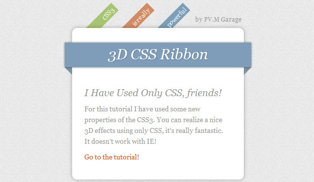
View Demo or Download CSS3 Code Files →
2. CSS3 menus, navigation and buttons
2.1. Apple.com menus in CSS3
Learn how to create the famous Apple.com menu with CSS3.
2.2. Animated horizontal menu in CSS3
A simple tutorial to show you how to make an animated CSS3 menu with different effects.
2.3. Animated vertical menu in CSS3
2.4. Animated CSS3 buttons
Great tutorial with 7 examples of animated creative buttons.
2.5. Creative animated menu with CSS3 images
In this lesson, just eyes run up from the presented 10 examples. Such complex creative menus used to be created exclusively using JS. Impressive!
2.6. Circle Navigation Effect with CSS3
Unusual effect when hovering over the selected navigation item in the form of a circle with an image. Take note!
2.7. Dropdown menu in CSS3
A tutorial for implementing a simple dropdown menu with CSS3 sublevels.
2.8. CSS3 navigation with animated transitions
3. Different effects on CSS3
3.1. Animated tooltip in CSS3 without jQuery

Thanks to the development of web technologies and modern browsers, we can create many effects without using Javascript. This has made life much easier for web developers. After all, now we can create effects in pure CSS without using Javascript. Therefore, in this article I want to tell you about whether it is possible to create banners in pure CSS, what is required for this, as well as the pros and cons of this approach.
CSS3 provides a wide range of possibilities, you just need to use them correctly. As an example, I want to give links to my past work "Characters in pure CSS":
First, I want to give examples of my CSS banners. Perhaps you have already seen them on the site, but did not even know with the help of what and how they were created.
About the demo: each example (banner) has a duration in seconds at the bottom, as well as a "Refresh" button, which starts displaying the banner from the beginning.
Banner # 1 - "Individual training in site building":
I created this banner for about 2 days. Why so long? Because it took some time to adapt the banner (to make it rubber) when recalculating coordinates. Now its size depends on the width of the parent block (which contains the CSS banner itself).
I created this banner in just 2-2.5 hours. The only thing that slowed down the creation process was the choice of icons. Because they had to be selected close to the banner theme.
This banner also stretches depending on the width of the block container in which it is located. It took about 1.5 hours to create it.
Such banners look very nice, but is everything that simple? Let's take a look at the pros and cons of this way of creating banners.
Advantages and Disadvantages of CSS Banners:
How do I create a CSS banner?
1 Idea
First, you need to know exactly what animation the banner should have (what, where and where it should move from and where to appear). You can take an A4 sheet and draw where each element will move and what should be on the banner.
After all, you cannot start creating a banner if you do not know what it should be and how to function.
2 HTML structure
The next step is to create the HTML markup so that the elements can be moved (and animated for them). That is, you cannot do everything with one image, which will move to the right or left, and this is where the animation is over.
As a rule, there is one common block in which all the others are located. And in this general block, we can manage the elements as we need it.
3 CSS animations
The final stage is to create animation for the blocks, as well as writing styles for them, because some parts of the animation are hidden by default.
To create your banner, you need to have a good command of the basics of CSS and HTML.
Learn basic CSS animation with this tutorial -.
Output
Everything modern browsers support CSS3 properties, which means that banners will be displayed correctly in such browsers. But with the help of JS plugins, you can create CSS banners for older browsers. After learning the basics of CSS animation, you will understand the process of creating banners and will soon create your first banner with pure CSS! 😉
 Software you might find useful
 Iphone 6s plus 16 rose gold
 Asus tablets See the new asus gaming tablets
 Utility for automatic driver search
 OMEN Product Line All key features of the HP Omen X System
 Carambis Driver Updater is a program for automatically finding and installing all drivers on almost any computer, laptop, printer, webcam and other devices
 What do you need to know when buying a laptop?